
E! NewS IOS APP Redesign
E! News is a cable television network under the NBCUniversal division of Comcast. The network boasts an audience reach of ~94 million households and the online entertainment news offering averages ~460 million annual visitors worldwide.
Responsibilities:
Conduct user tests and interviews to identify usability issues
Provide detailed requirements for engineering teams (both in-house and abroad)
Create user flows for both the external product and the complex custom CMS for internal usage
Design wireframes and interfaces using Sketch, InVision and Proto.io
Work closely with the research team to monitor KPIs
The Team
UX Designer (me)
Visual Designer
Motion / Ads Designer
Product Manager
Project Manager
Data Analyst
Engineering Manager (Overseas, 3rd party)
Technical Product Manager (Overseas, 3rd party)
THE PROBLEM
While the desktop and mobile web platforms had very recently undergone a redesign, the app itself had largely not been iterated on in 2+ years and was now comparatively outdated. We decided to start the project from scratch with a fresh perspective.
The Process
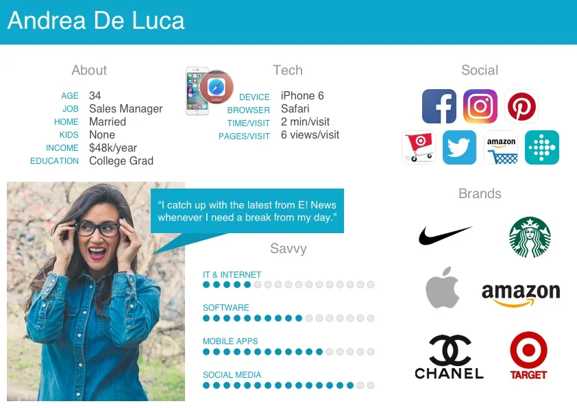
User Persona
I gathered data from comScore, Omniture, Adobe Analytics, Pew Research Center, Nielsen Norman Group, and Moosylvania’s Brand Rankings report which I used to create E1’s first-ever user persona. This persona is representative of our primary demographic and kept our design concepts aligned with our user’s needs and abilities.
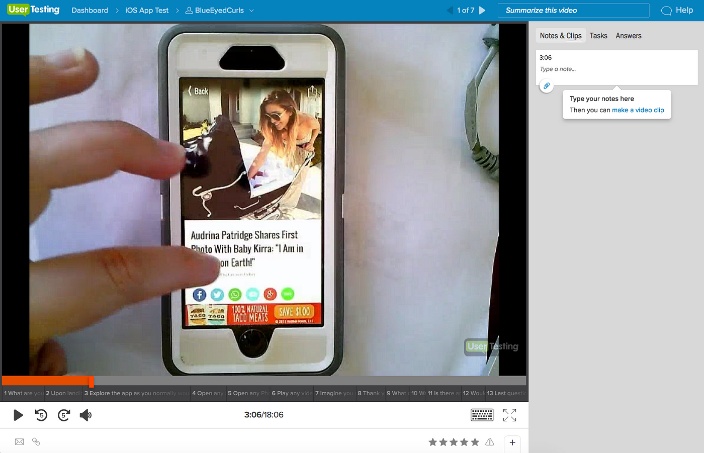
I conducted remote, unmoderated, user tests and interviews (link to test plan) with 7 participants to establish a baseline of overall usability. This was the first user test ever conducted for E! and the results were immediately useful in resolving multiple internal debates.
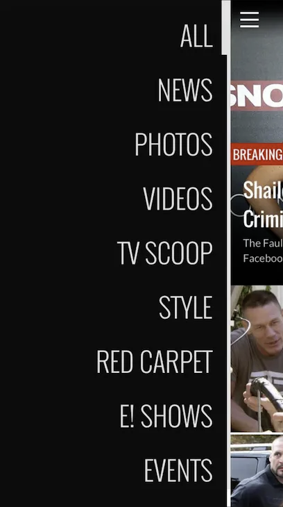
After analyzing the results of the usability study, I identified key problems with our app’s navigation structure. I created a site map to help visualize the challenges users were experiencing and proposed a new structure to alleviate those issues.
Original architecture
New architecture
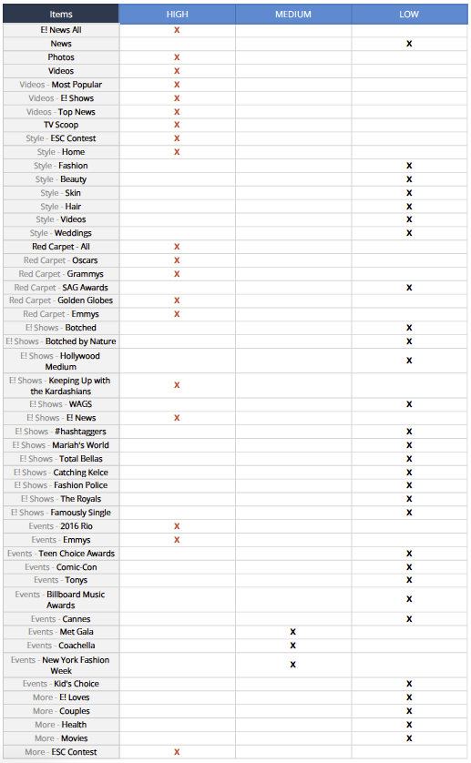
After analyzing user engagement data and cross-referencing the insights leverage from the usability study, I organized a content prioritization list to help us structure our new architecture.
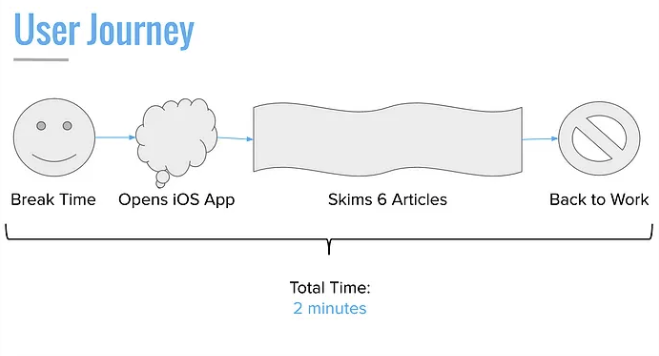
I also put together a lightweight user journey to help stakeholders visualize user behavior and motivations.
Through my efforts, I determined that a happy medium between user goals and business goal would be achieved by prominently featuring News, Videos, and Photos pages within the new design.
Design COnsiderations
Navigation
Navigation was found to be confusing for users for the reasons identified above. We also needed to create distinction between All and News sections and re-label subsections so that they’re less subjective and clearer for users to interpret.
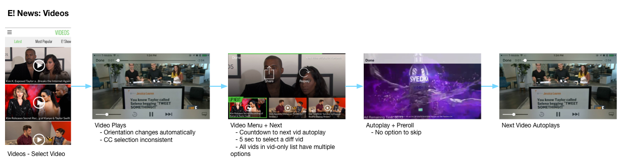
Videos
Videos generate a large percentage of our ad revenue and yet we were delivering an experience that was markedly unsatisfactory to users we tested. Noteworthy considerations include:
We were changing the orientation of the videos from portrait to landscape automatically and without any indication from the user.
Closed Captions were often unavailable
There was a 5 second delay and countdown timer between videos that left users feeling impatient
Ads would autoplay with sound on without warning and without the option to skip
We also livestream web shows that would need to be easily accessed through the app
Photos
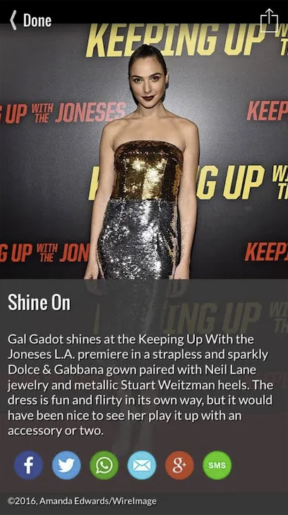
E! owns the rights to the red carpet experiences of the majority of celebrity awards shows. Awards show celebrity fashion content is one of our largest drivers of site and app traffic. I determined through user testing that users were having a difficult time navigating between images and galleries.
Results
Unfortunately I left E! while the app was still in development and was unable to capture success metrics following the launch. However, measuring success was always going to be a challenge because we used 3rd party tools to funnel out negative app store reviews and new app downloads would not be a considerable indicator of whether the redesign was successful. If I were able to review KPIs I would have looked closely for app usage, total time spent in app, time spent per page, number of pages/video/images visited, and the rate of app deletions.
Following launch the app was nominated for a 2017 Emmy Award for Outstanding Creative Achievement in Interactive Media within an Unscripted Program.
2016 Emmys Glambot
The GlamBot is a 360-degree slow motion camera used on-location at the biggest Red Carpet events and livestreamed for 8-10 million unique viewers via Desktop and Mobile devices.